Peecho Product Listing
SKILLS
UI DESIGN • VIBE-CODING
YEAR
2025
INTRO
Peecho is a print-on-demand platform under the Prodigi group. It’s been around since 2005, serving both B2C and B2B customers. A big part of our merchants use the dashboard to create products and sell them without holding any inventory. We call them ”longtail.” While they don’t generate the highest volume of orders, they bring strong profit margins, generating around 200K in revenue per year.
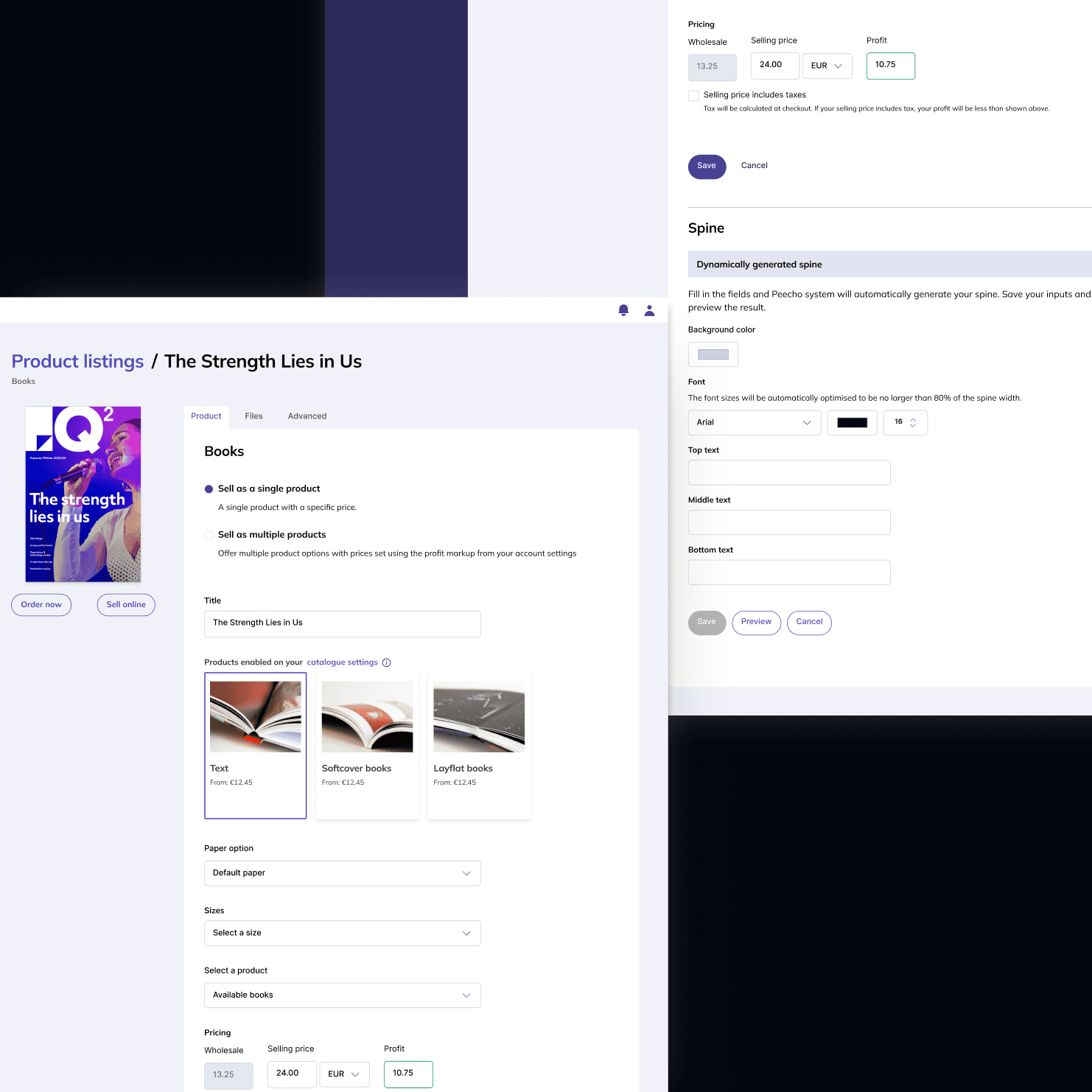
THE PROBLEM
Peecho’s platform UI had never been updated. It still had that 2005 look and feel, but more importantly, there was no clear flow. Merchants had to figure out on their own how to create a new Publication (a legacy term from when Peecho focused on self-publishers) and start selling. The lack of direction made a simple task unnecessarily complex.
SOLUTION
The solution was clear from the start: simplify everything.
3 tabs instead of clutter. We split the old page into separate tabs. The first tab puts essential elements front and center, everything merchants need to create a product. The secondary tasks were moved to other tabs where they don't get in the way of starting selling.
Clear, scrollable flow. All product attributes now appear in a logical order on the page. Merchants scroll down, make their selections, and save at the end. No more hunting for options or wondering what to do next.